How to Create a Poster People Will Read
What is a poster?
A poster is not an oral presentation or manuscript – it’s a hybrid that is more interactive than either
- Think of a poster as a visual abstract
- Viewers have limited time to view posters —you want yours to be noticed!
- Only present the main findings of your work
- Plan your poster around 1 or 2 key points: what is your take-home message?
- Save the background and details for the manuscript
- When viewers want more information:
- Provide handouts/supporting material
- Include your email address on the poster
- Provide a QR code to link to your work online
The “better” poster layout
Developed by Mike Morrison at Michigan State, the "better" poster uses a more efficient, less text-heavy approach to poster display.
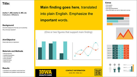
- Your take-home message should be the most prominent element on your poster
- Use plain language
- Include only minimal background/introduction, methods, & conclusion; summarize as much as possible
- Use graphs, charts, and images instead of text
- Use a consistent font throughout; sans serif fonts (Arial, Helvetica) are easier to read
- Stick to 2-4 complementary & contrasting colors
- Make your contact information clear
- Look online for good design samples or download our templates
Watch Mike Morrison's entertaining "better" poster videos:
What belongs on a poster?
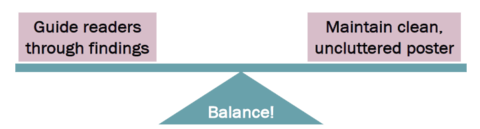
Content and Organization
Goal: present your findings while maintaining a clean, uncluttered poster.
Use “W”s (who, what, when, where, why) to organize elements of poster
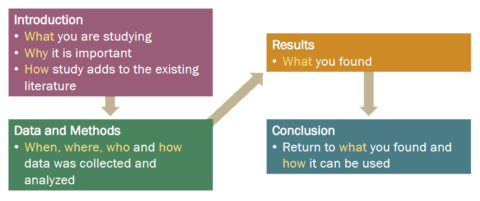
- Main findings at top or center
- 2-3 bullet points for Introduction or Background. Be specific to your topic only; no detailed background or introductory information
- Single-sentence Aim, Hypothesis, Purpose, or Objective; this can be bolded or in spotlight color
- Keep Materials and Methods brief - give overviews, not specific detail
- Discussion section (if needed) keep to 2-3 bullet points
- Be creative with Summary or Conclusion header; try something like “Clinical Implications,” or “Impact on Current Research” instead
- References - not needed on posters!
- Acknowledgements - thank those who helped you with your research (excluding co-authors)
- Funding - ALWAYS note any sources of funding you or co-authors/mentors have received for the work
- Disclosures are often required - check presenter instructions
Follow instructions regarding:
- Final printer poster size
- Vertical vs. horizontal orientation
- Need to include abstract or poster number?
- Logos: be sure any logo you use is allowed, up to date, and in high resolution
- Title of the poster should be exactly what was submitted to the meeting or conference
- Authors’ names: in correct order, preferred names, spelled correctly, degrees
- Affiliations: group same department or division affiliations
- Double-check: correct spelling of names, correct degrees if used, correct department, division, and institution names
Text and color
Text tips
- Do not use all uppercase lettering, even for title
- Avoid text justification, which disrupts natural reading
- Use a consistent font throughout; sans serif fonts (Arial, Helvetica) are easier to read
- Use BOLD font for titles, headings, and emphasis of key points
- Font size recommendations
- poster title: 80–100 pt
- authors and affiliations: 60–70 pt
- section headings: 50–60 pt
- body of poster: minimum 28 pt
Color tips
- Color is good! …but stick to 2-4 complementary & contrasting colors (emphasis is lost if too many colors are used)
- Use color to attract viewers to your poster, emphasize important points, highlight sections, or point out similarities and differences
- avoid red/green contrast, in consideration of those with color vision deficiency
Best practices for images
- Use high resolution images only. Images copied from an online source are often NOT suitable for printed posters (contact the Design Center if you are unsure about image quality)
[click for larger view]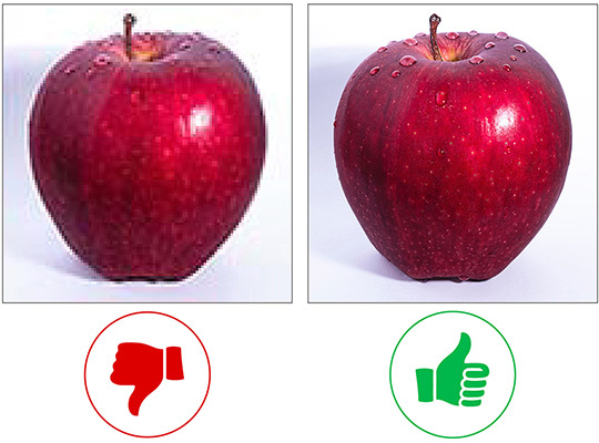
- create clear separation between images
- if adding arrows or other elements to images, use thick lines and contrasting colors
[click for larger view]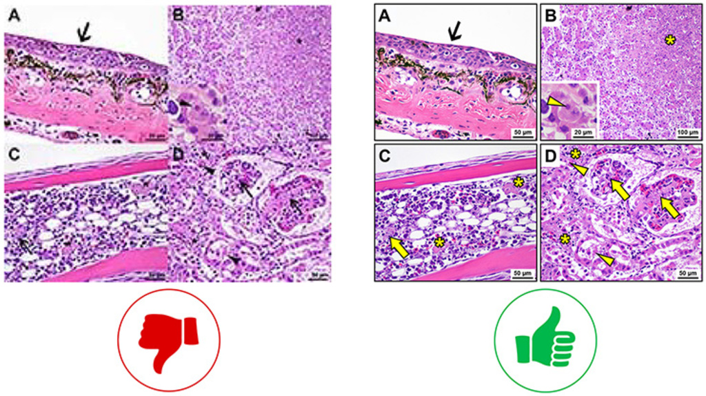
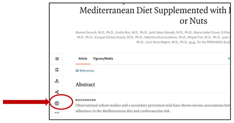
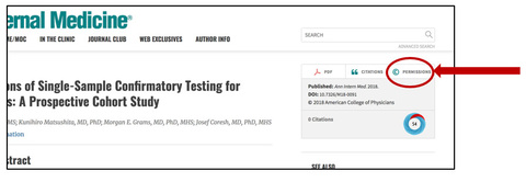
- Never reuse a previously published image without permission or at least citing the source
- Articles will always have a link to permissions - most publishers require permission to be requested through RightsLink
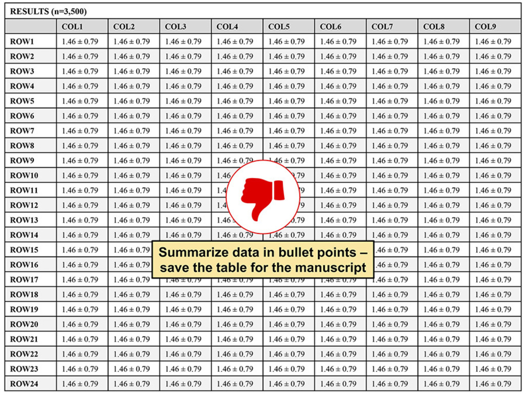
Figures, graphs, diagrams, and tables
General Tips
- Keep data to a minimum
- No need to number figures or tables
- Include descriptive titles or legends (place titles above and legends below)
Figures (graphs, charts, diagrams, illustrations)
Keep figures clean, simple, and uncluttered. See examples of each below.
Graphs and charts
Be sure to choose the appropriate graph type. Here is a good resource: https://www.clips.edu.au/displaying-data
| Goal | Type of Graph or Chart |
|---|---|
| Compare values | Column, bar, circular area, line, scatter plot, bullet |
| Show composition | Pie, stacked bar, stacked column, area, waterfall |
| Show distribution | Scatter plot, line, column, bar |
| Analyze trends | Line, dual-axis line, column |
| Show relationship | Scatter plot, bubble, line |
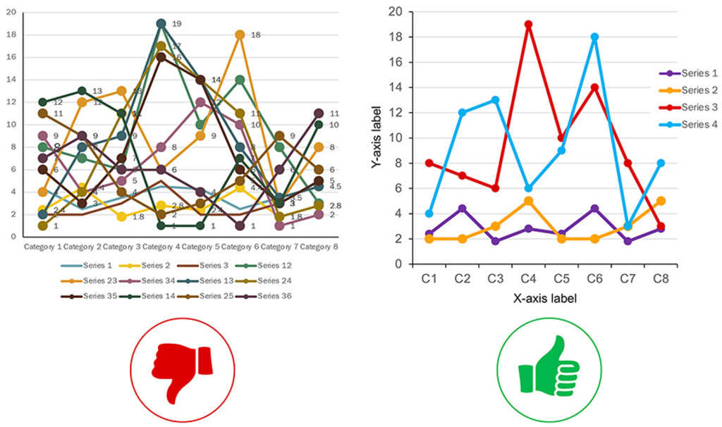
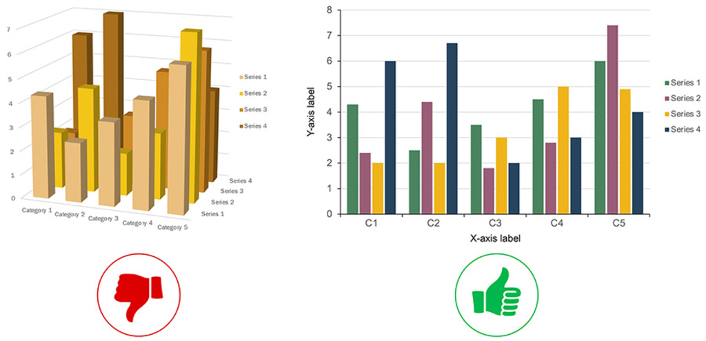
- Use clean, simple 2-dimensional graphs and charts
- Avoid excessive labeling and superfluous features (arrows, data labels)
- Use high contrast colors; avoid red/green contrast, in consideration of those with color vision deficiency
- Avoid thin lines
- Avoid light colors on light background
Examples of bad vs good graphs

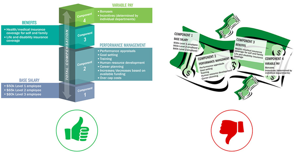
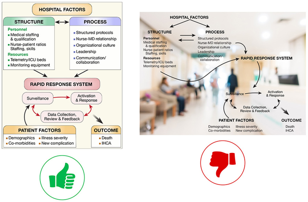
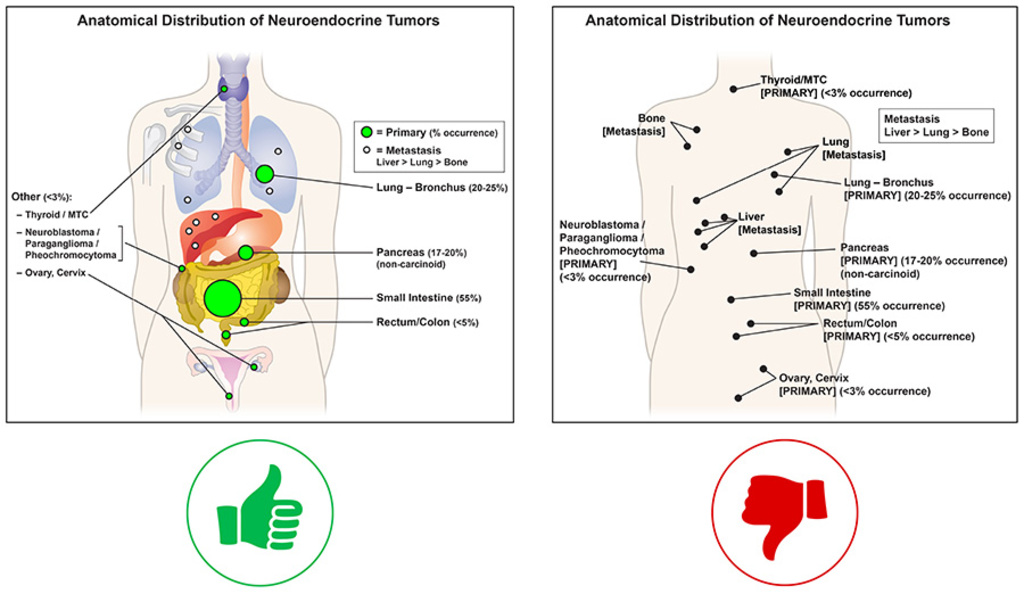
Diagrams and illustrations
- Use clean, simple elements
- Avoid light colors on light backgrounds & dark colors on dark backgrounds
- Avoid busy backgrounds
- Avoid excessive labeling - use the image to SHOW rather than text to TELL
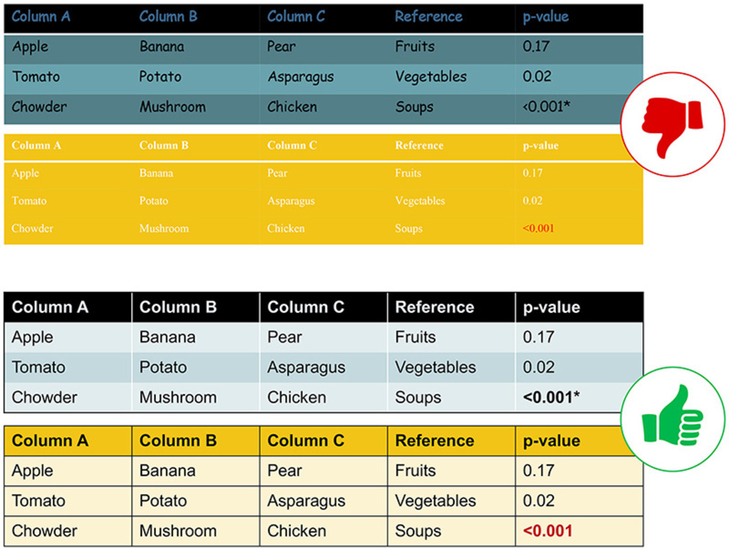
Tables
- Use tables in place of Results text - do not duplicate data in text and a table
- Table design should not upstage the data; avoid overly complex design elements (be careful when using premade table formats available in software applications)
- Use a sans serif font: Arial, Helvetica
- Highlight only statistically significant data; use bold or contrasting colored text
Examples of bad vs good tables
General tips
- Give the poster room to breathe! Blank space between columns and graphical elements is important
- Size proportionately: if final poster size is 42x60, set up PPT at 21x30
- E-posters should follow same guidelines as print posters, with some allowance for smaller overall size
- If a PDF file is required for upload, be sure to export as a high resolution file: learn how here
Other considerations
- Plan ahead! Give yourself plenty of time to pull information together, format the poster, and get it reviewed by co-authors/mentors
- Check with the your printing service about lead-time requirements; the Design Center requires minimum 2-3 business days; others will vary
- Consider poster material: fabric folds for air travel, semi-gloss paper for most in-house posters, matte paper for drafts
- Less ink is better! Don’t use a lot of it—use it effectively and selectively.
- Posters are not cheap – identify your funding source early (some examples are research grant, departmental or start-up fund, gift account, self-pay)
- Upload posters for printing online with the Design Center job request form